Most lyric videos are often seen as the poor cousins of music videos, and have always been a quick way to promote a track. Indeed, they are easier and cheaper to produce than a music video, sometimes they just act before the « official music video » is made. It has also sometimes been a way of putting emphasis on the lyrics themselves when it seemed relevant.
Let’s be honest, the quality of these lyric videos has always been all over the place, with sometimes great ideas but more than often having not so good visual & typographic execution, or a smart gimmick that as cool as it is for 15s quickly bores out, or a karaokesque subtitles over a cheap forgettable video… In other words, there’s a pretty high chance you will click on skip or close way before the end.
(There are some notable exceptions that are works of art, I will dedicate a future post to them).
And I don’t mean to criticise, it’s actually a pretty hard task to make something heavily typography focused that is pretty, goes fluidly with the songs and keeps you entertained for all its length…
For Those I Love – Mirror
In that regard I recently stumbled on one that quite struck me : actually labelled as a “visualizer” , it’s a song called “Mirror” from the Irish artist David Balfe that makes music under the name “For Those I love”. The clip was directed by Niall Trask, let’s watch it right below :
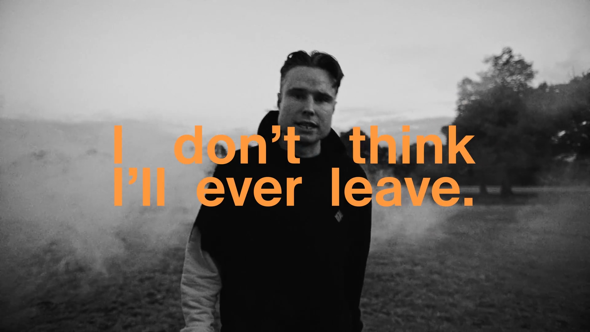
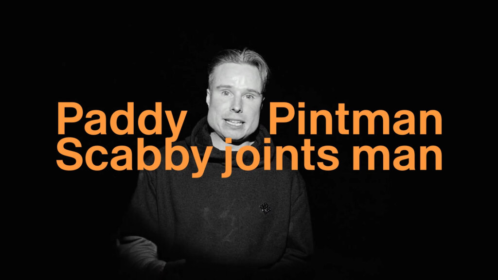
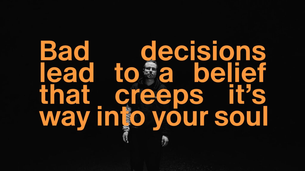
The whole video is David walking towards the camera, shot in a grainy gritty black and white. Layered over him, the lyrics of the video, in a beautiful orange Helvetica Bold that almost takes the whole screen space.
The typography here is not a subtitle, not a side helping graphical asset, but a main element, equal with David’s shots if not more important (and actually going upfront over him).
It’s well designed, and note how the fully justified text create some empty spaces between the words, creating some variations, putting accent on some parts and also leaving visual space for parts of the video below, sometimes going so well and linking the type and visuals together :
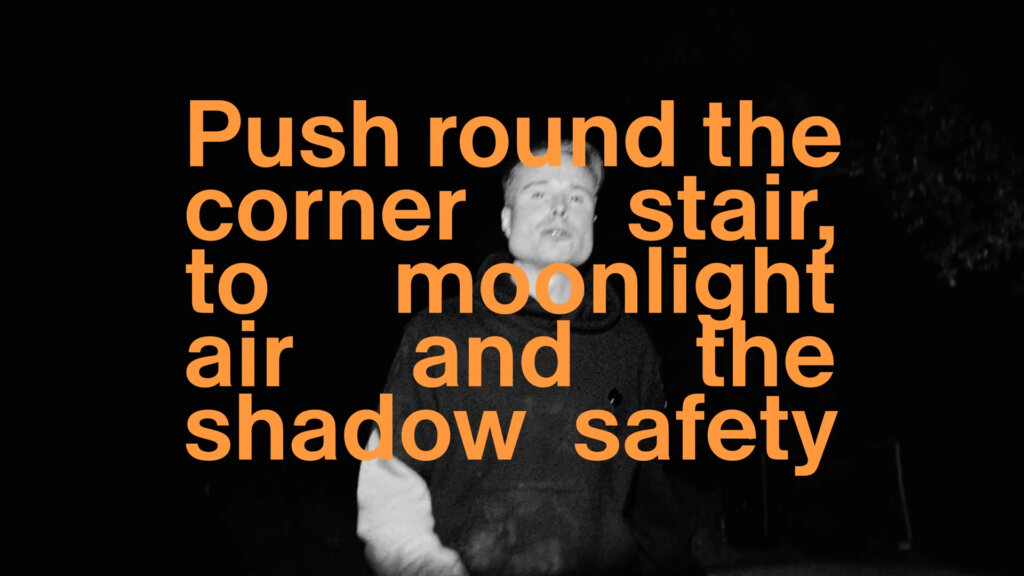
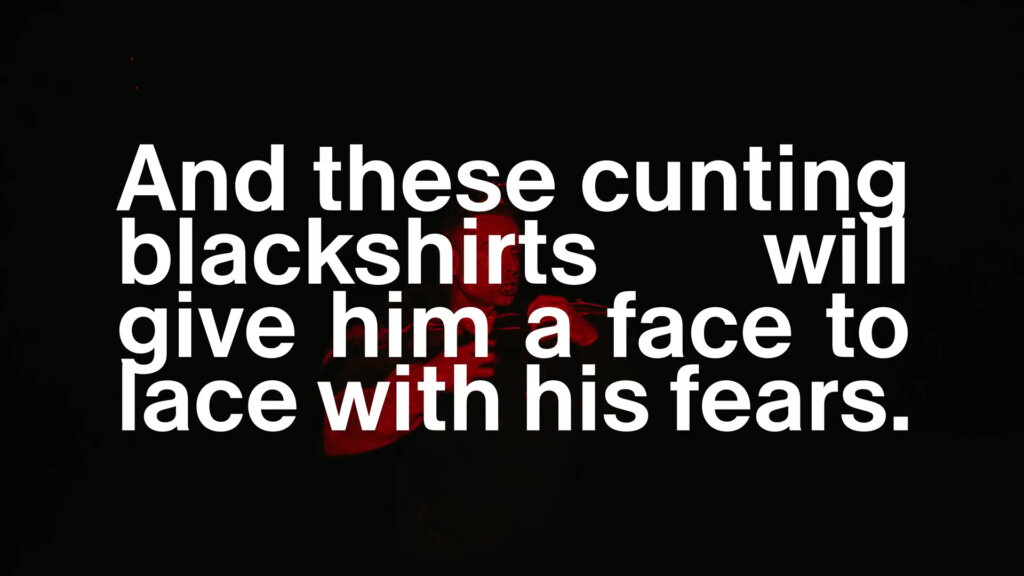
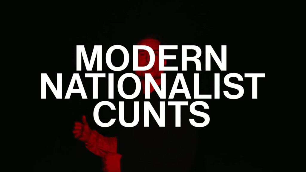
Also, towards the end, as the song reaches a peak, David’s images become tinted red and glitchy, while the type goes white, sometimes in uppercase, flowing together in pure raw power (while we actually hear lots of curse words).
Why it works
Is there a recipe for making a good lyric video ? I don’t think so, but let’s see why this one breaks through :
– Consistent typography (except the thumbnail for nos reason)
– Nice design (subject to taste, but objectively good font choice and well tuned)
– The type has a central role in the video
– Symbiotic evolution of type and other visuals as the song goes on
– Something simple done nicely instead of the opposite
You will see that most lyric videos fail to succeed at at least one of these conditions, I mean even Kendrick Lamar who has some of the best music videos over the last 10 years, has average half crappy lyric videos (check for yourself is you don’t believe me).
So I guess, well done David ! You crafted real design work here, that goes fluidly with the song in its form and purpose, that is not overdone, and that illustrates how visuals can really empower a song.
So, what do you think, lyric video or music video ?
Credits
Artist : For Those I Love → https://linktr.ee/forthoseilove
Images : © Niall Trask → https://thekillshop.cargo.site/
Production Company: Riff Raff Films
Director Niall Trask: Nialltrask
Executive Producer: Natalie
Owner of Riff Raff: Matthew Fone
Producer: Zoe Gunn
Production Assistant: Marcus Kartal
Production Assistant: Lilli MacMonagle
Director of Photography: Mike McMillan
Focus Puller: Nat Rowbotham
Production Designer: James Middleton
Editor: Ed_jazeera
Grade: Thomas Kumeling
Grade House Producer: Grace Evers-Green
Grade House: DOMA
Leave a Reply