Bicep is an electronic music duo from Belfast, consisting of Andrew Ferguson and Matthew McBriar. After almost a decade of EP’s and singles, they finally released their first eponym album in 2017.
In addition to the excellent music, the album’s imagery is a pure work of art !
(you might find me biased but well, Four Tet remixed them, what’s a best street cred certificate ?).
From paintings to motion reels, let’s see how a visual identity system shaped an album’s communication campaign.
Entrusted with the task of producing content for 4 singles and 1 debut album,
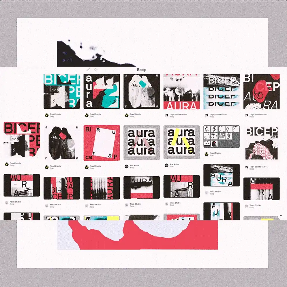
The Royal Studio, a Portuguese design studio, enrolled Lyft, Ana Types Type and Xesta Studio to work as a global collective for this process.
While being obviously talented, their approach has been very interesting .
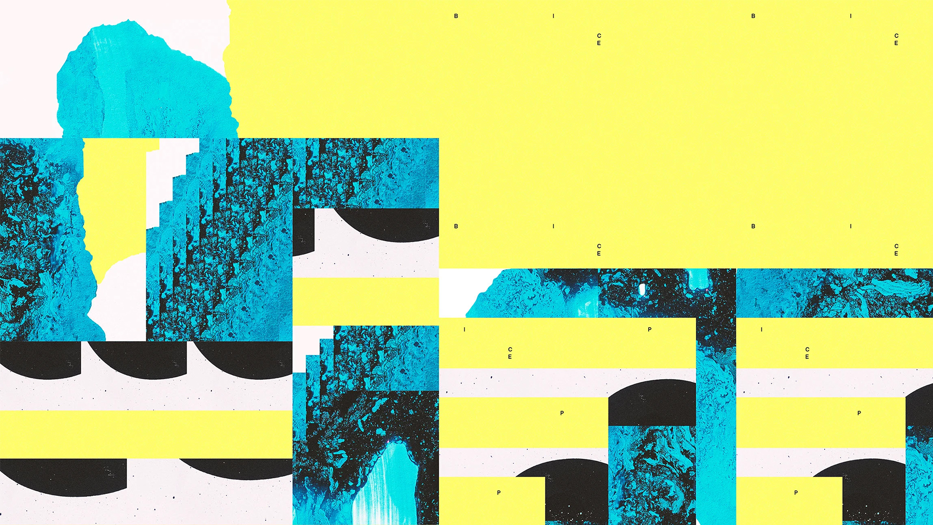
The beauty of analog
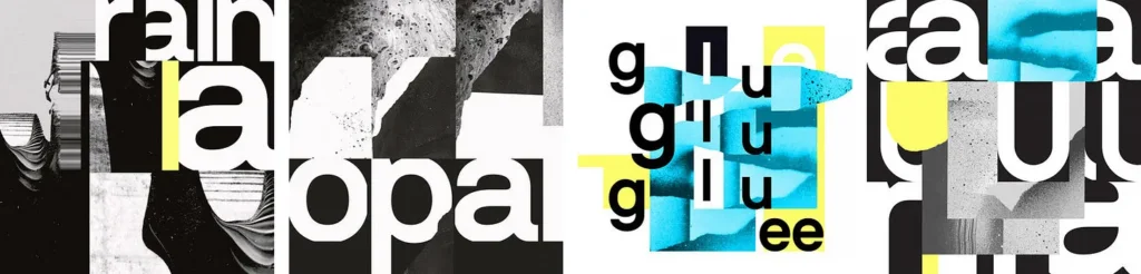
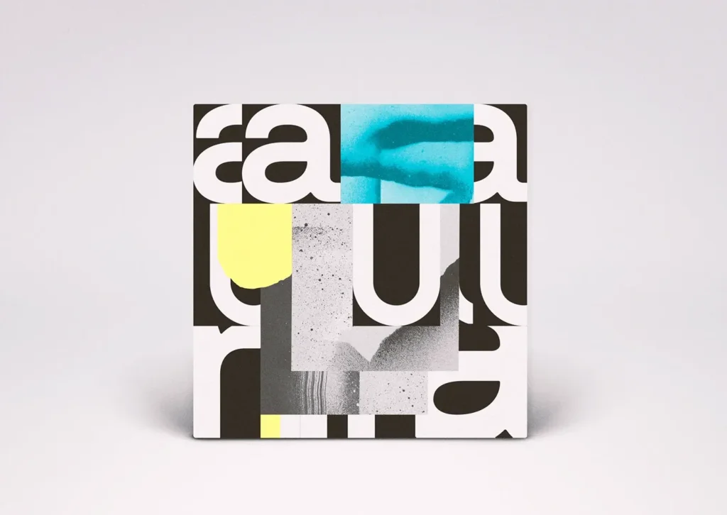
One first thing to note is that they started with a pure analog process, using abstract painted strokes on paper that they later scanned. As they produced a huge amount of content, this allowed for a lot of experimentation in terms of shapes, textures and colors, that fit well with Bicep’s densely layered music.
Designers have always been scanning hand made creations into digital forms, but as today we are overwhelmed with premade texture packs, assets, and analogs effects,
it’s always nice to remember how making your own can give a true distinctive look, as well as bringing the joy of trial, mistakes, happy accidents and some kind of uncontrolled chaos that makes us humans, both in the process and the result ↓
Consistent chaos
Another great thing is how they defined a whole articulation in their designs, by giving rules and making choices.
Music is a combination of rhythms, sounds, lyrics and notes, evolving together following some patterns to form something nice to listen to. And electronic music is a genre that particularly lies within repetitive motifs that are “always the same but always different”, where all these elements blend and mutate together in contrast between fullness and emptiness.
That could apply to jazz also, but I mean there are kinds of music feeling like walking into the open unknown whereas your radio pop song feels more like that perfectly designed Airbnb flat. And that’s not necessarily bad, but it’s quite different.
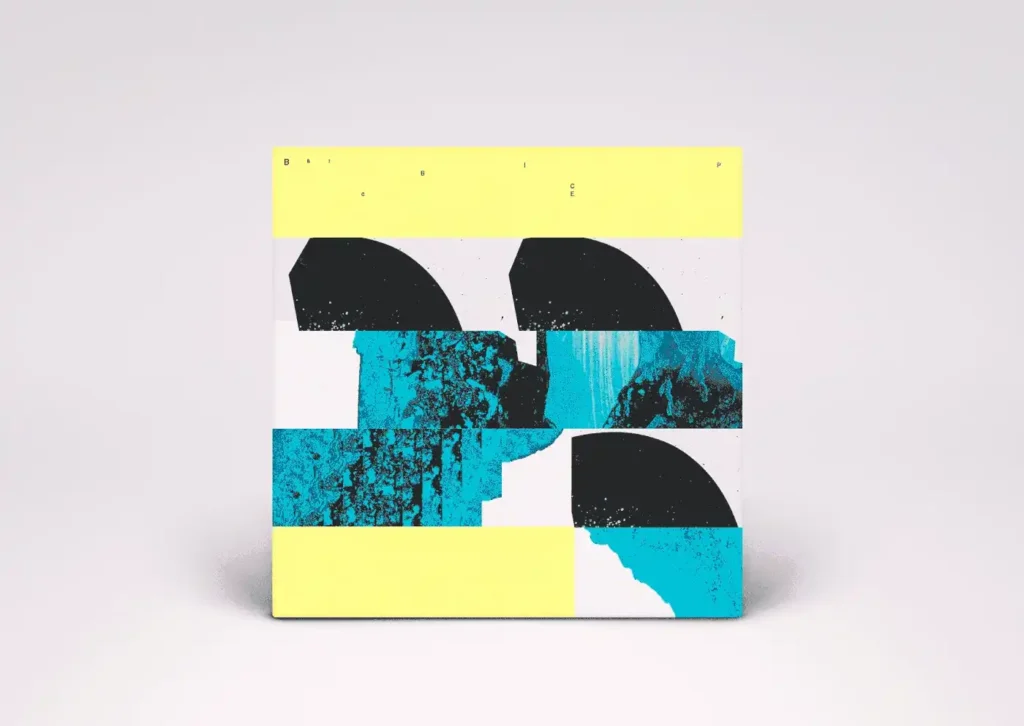
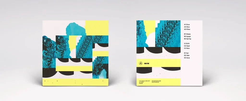
In that regard, (quoting them) they settled for “a strong acid yellow representing the music, combined with a neutral typographical approach”.
Add to this the other elements of the recipe :
– A complimentary acid blue
– The raw power of black and white
– Rectangular shapes enclosing the scanned material
– A composition language of repetitions from micro to macro
and you get a beautiful and unique album identity.
So why a visual design system matters, you might ask ?
Well, in this world where you have to communicate all the time everywhere, it enables the people to work on it to have guidelines, rules, and material to work with.
It facilitates to create content, and to be seen and recognised everywhere.
Music is polarity
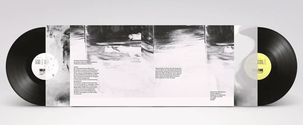
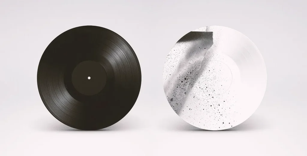
On top of this, they made bold choices about the physical format of the LP vinyl for AURA, one of single from the album.
As music is, in its essence, a succession of sounds and silences, they chose to print the side of the vinyl actually containing the music track in full black, letting it take the whole space, and on the other side, they made a white textured screenprint which is purely visual and doesn’t contain any readable music.
Your AI’s not an AD
(AD = Art Director).
As a closing note, I think Bicep’s album campaign is an excellent example of great art direction.
Anyone can make a beautiful single image (especially nowadays when a 5 year old kid with Midjourney can). But the role of an art director is to create a statement, something unique, impactful and aligned with the brand or message.
This is brilliantly showcased here, with a set of designs that are musical in, their own way, coherent, complementary, and endlessly adaptable.
Also, I am a firm believer that a strong idea is always more powerful and durable that any visual eye candy, as beautiful as it may be.
In conclusion, Bicep’s first album is a perfect example of great design for music : using analog paintings and scans to build an identity that works across print, motion, and digital.
Last but not least, take a listen at the album right below !
Credits
Artist : Bicep → https://linktr.ee/feelmybicep
Images : © The Royal Studio → https://theroyalstudio.com
© Lyft Studio → http://www.lyft.pt
© Ana Types Type → https://anatypestype.com
© Xesta Studio → https://xestastudio.com
Leave a Reply