
In every creative field there are all kinds of people making stuff, and some of them are legendary. Reid Miles is one of them, and he’s behind so many iconic album covers of the artists from the famous jazz music label “Blue Note”, some that you probably know if you were born before Y2K’s bug.

Let’s go back in time a bit. We’re in 1956, Reid Miles is 29 years old and has already been working for a few years when he is hired by Francis Wolff, cofounder of Blue Note, to design covers for the upcoming albums.
(Fun fact: after his discharge from the Navy, Reid enrolled at the Chouinard Art Institute mainly for dating a girl studying there, and then he clicked with design).
Quick culture tip: In jazz, a “blue” note refers to a note in the scale that is altered, (commonly the 3rd, 5th and 7th note half a step down), to create some emotional tension, often slightly sad and “in between”.
It’s very typical of that profound human feeling we usually find in that kind of music.
Visual Liberation
At this time, most jazz album designs were quite conservative : a glorified photo of the artist, relatively shy and informative typography, an overall look that could be a bit bland.
Nothing inherently bad, but by no means as powerful as Reid’s work that was about to come.
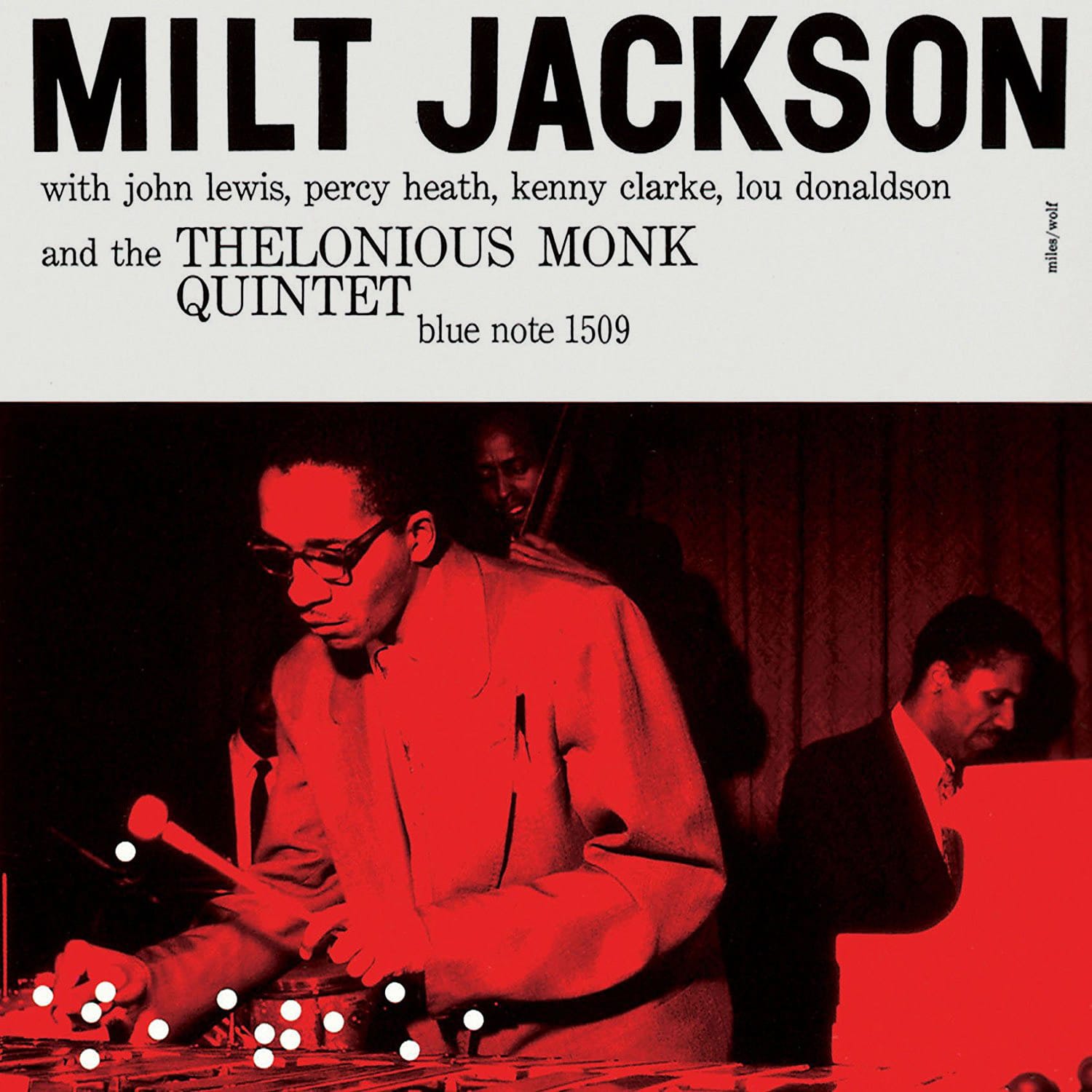
His first real cover for Blue Note is considered to be “Milt Jackson and The Thelonious Monk Quintet”, crafted in 1956 (note that the 1509 number on it refers to the album’s catalog number).
What Reid did here is quite interesting: using the white dots as if they were the notes played on the vibraphone, which has been one of the the elements of his style as we will see.
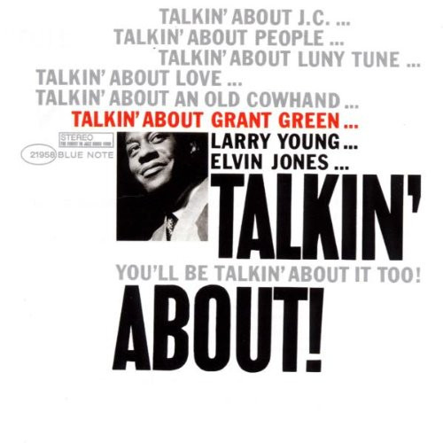
For the next two decades, he then designed about 500 album covers for Blue Note, shaping a unique visual identity for the label (Yes, that’s about one per week, and without Ctrl+Z).
Some key elements of his style paved the way for a more modern approach in covers, rooted into a playful mix of graphic design, typography and photography.
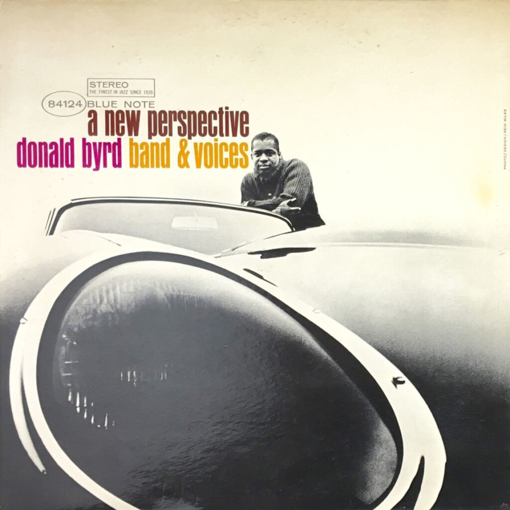
At that time, these elements matched broader graphic design trends: offset lithography and other technical evolutions made it possible to mass-print photography on album covers (opening a new world of gradients, inks, and collage workflows). Typography was becoming bolder (especially sans-serif fonts), and bright colors replaced sober hues…
Just to say that Miles didn’t create these elements per se, but he absolutely mastered them and pushed them real far !
A new signature
With that amount of production, he took the liberty to experiment in lots of different directions sometimes resulting in very unique covers, but there are some key elements about his work that we can cleary see ↓
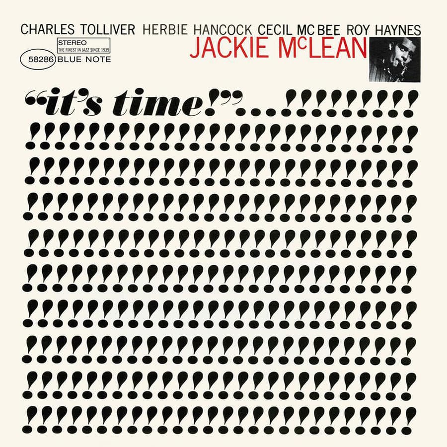
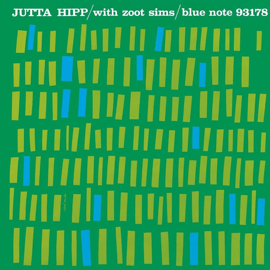
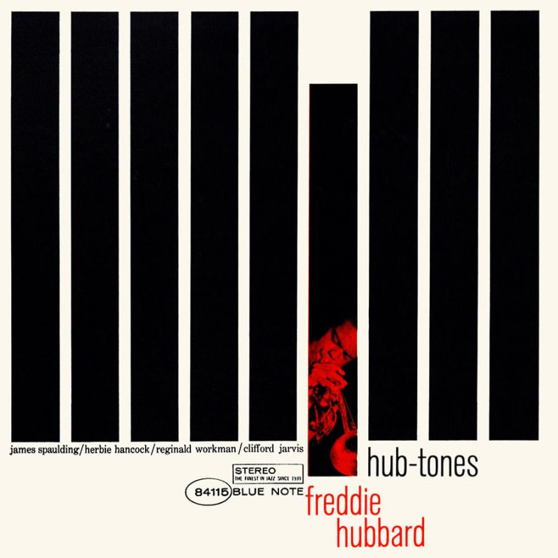
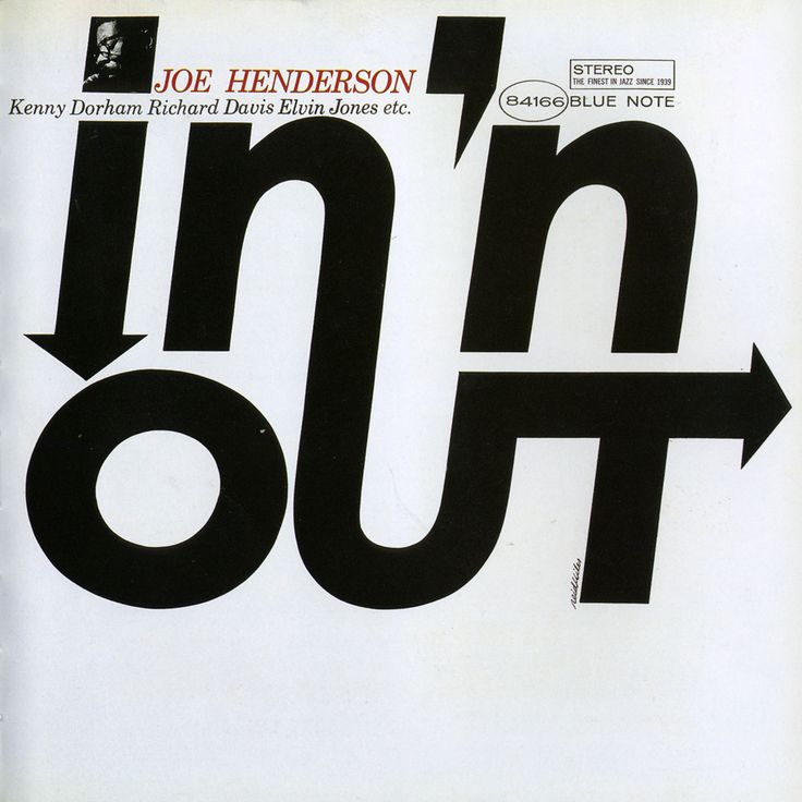
Shaping the music
On some covers, Miles took a very interesting approach: using simple shapes working together to actually “visualize” jazz music, like if they were the notes played by the musicians.
It was quite innovative at the time, reflecting the modernist goal of expressing the feeling of listening to the album instead of just naming and showing the musicians.
It made the covers “look like they sound”, participating to the label and artist’s notoriety.
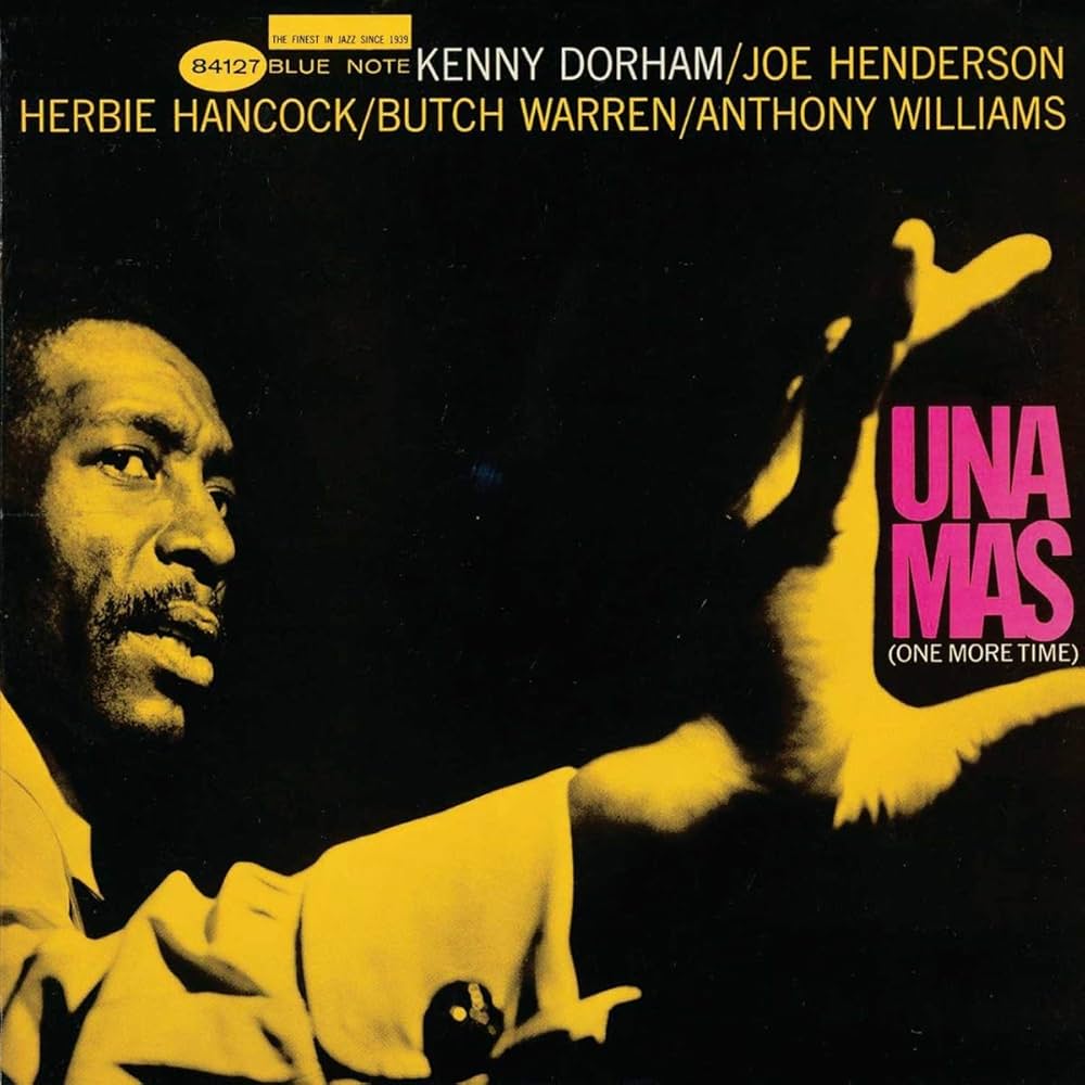
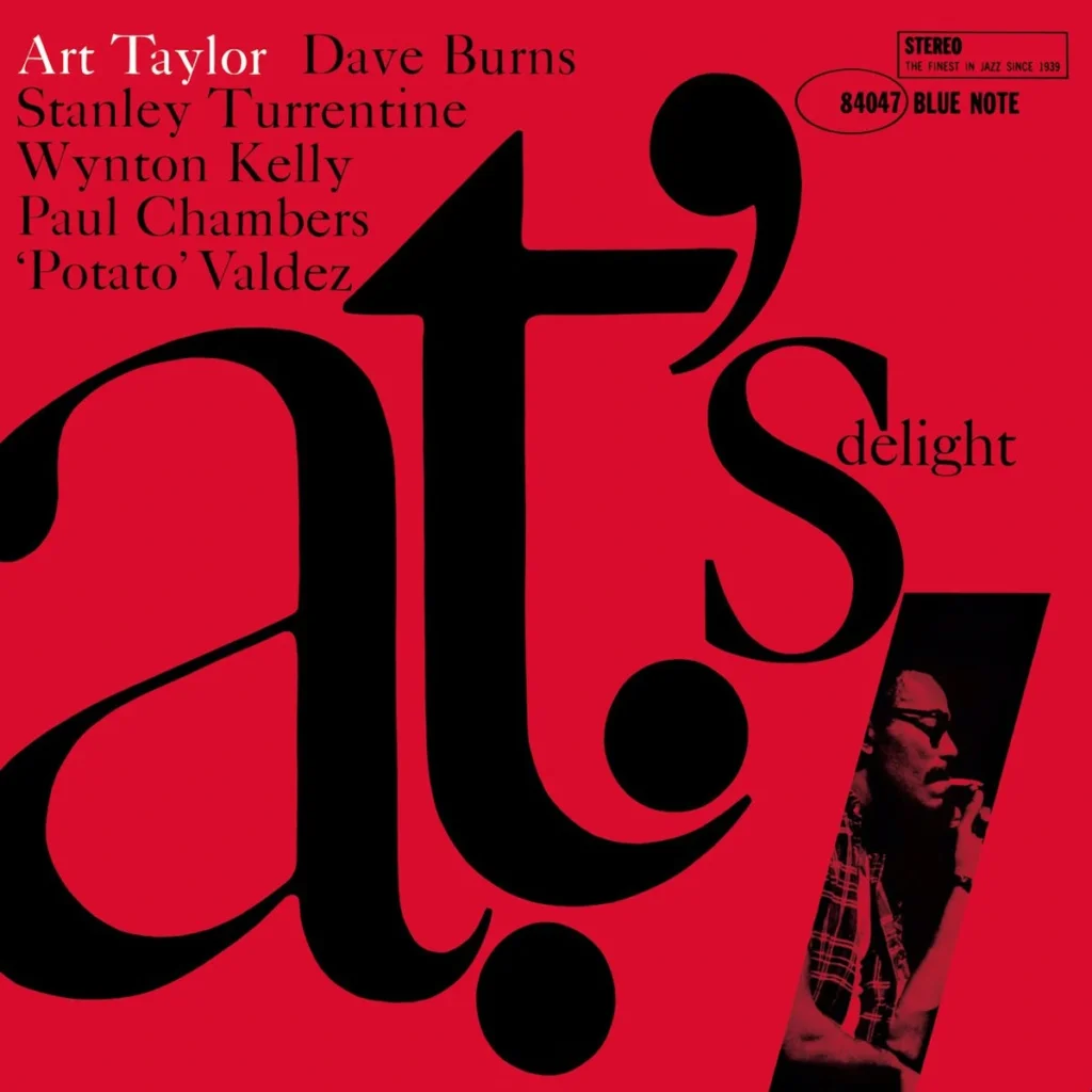
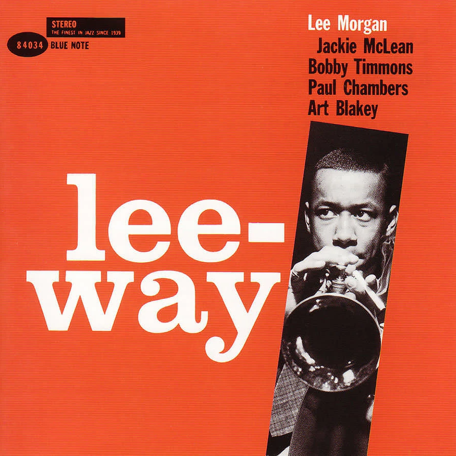
Playing with photography
Soon after he started, Miles teamed up with Francis Wolff (Cofounder of Blue Note if you are still following, are you ?) who actually was a photographer. Their work as a team proved incredibly strong.
Wolff had his own unique way of photographing artists: raw, intimate, sometimes showing them playing deeply, sometimes experimenting with unusual perspectives, capturing them as the humans behind the music , far from the bland corporate style prevalent at the time.
On top of that, Miles integrated his shapes, colors, and type treatments in a playful and mischievous way, treating everything as one visual entity and always trying to craft something distinctive.

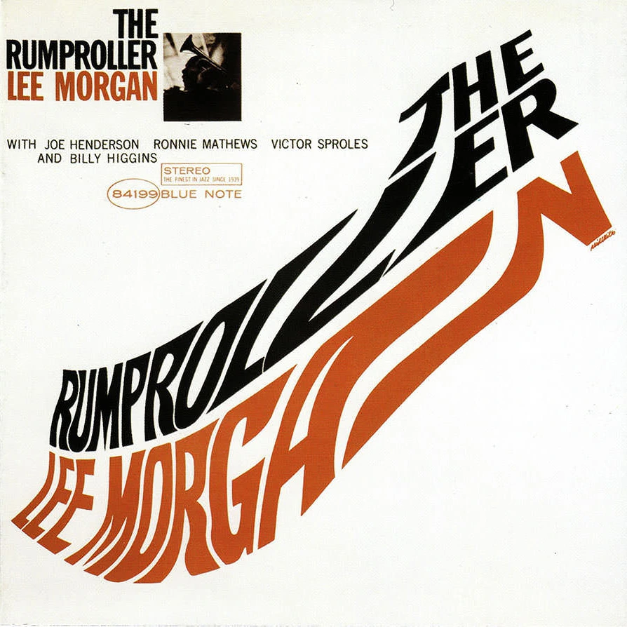
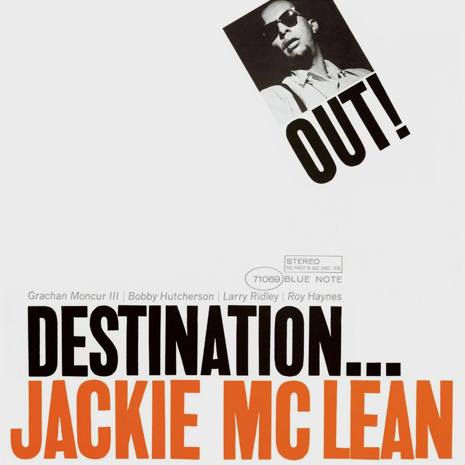
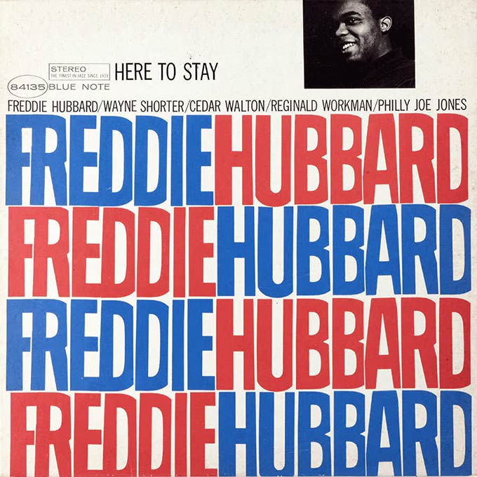
Being abstract and bold (with wit)
As years passed, Miles started to be even more experimental, treating Wolff’s pictures as pure graphic assets that he would cut and manipulate at will into his compositions, while using even bolder type, punchier colors, and sometimes fun takes on album names.
Genius with a distance
Lastly, one interesting to note about Reid Miles is that he wasn’t even a fan of jazz but preffered classical music ! He apparently didn’t care much for the records and would give them to friends or traded them for classical music ones…
This is a nice example of what it means to be a great art director: being able to produce outstanding work even without being a pure fan of the brand or subject.
For sure, loving what the client does fuels inspiration, but we shouldn’t mistake design work for a personal art project (which has its own important value, of course).
Also, we can note that while experimenting in lots of directions, Mile’s work kept an overall consistency in terms of visual identity, which would became a real strength for Blue Note.
In the end, we can thank Reid Miles for paving the way for the future of album cover design, and for being a strong voice in graphic design while looking like Magnum P.I.
Bonus
There is so much to say about his work, I tried to keep it short.
But if you want to see more especially about his work with Wolff’s photographs, I encourage you to watch this short documentary from the great Channel Vox (which actually is a nice motion design piece):
Credits
Images : © Blue Note Records
Video : Vox Magazine → https://www.vox.com/
Leave a Reply